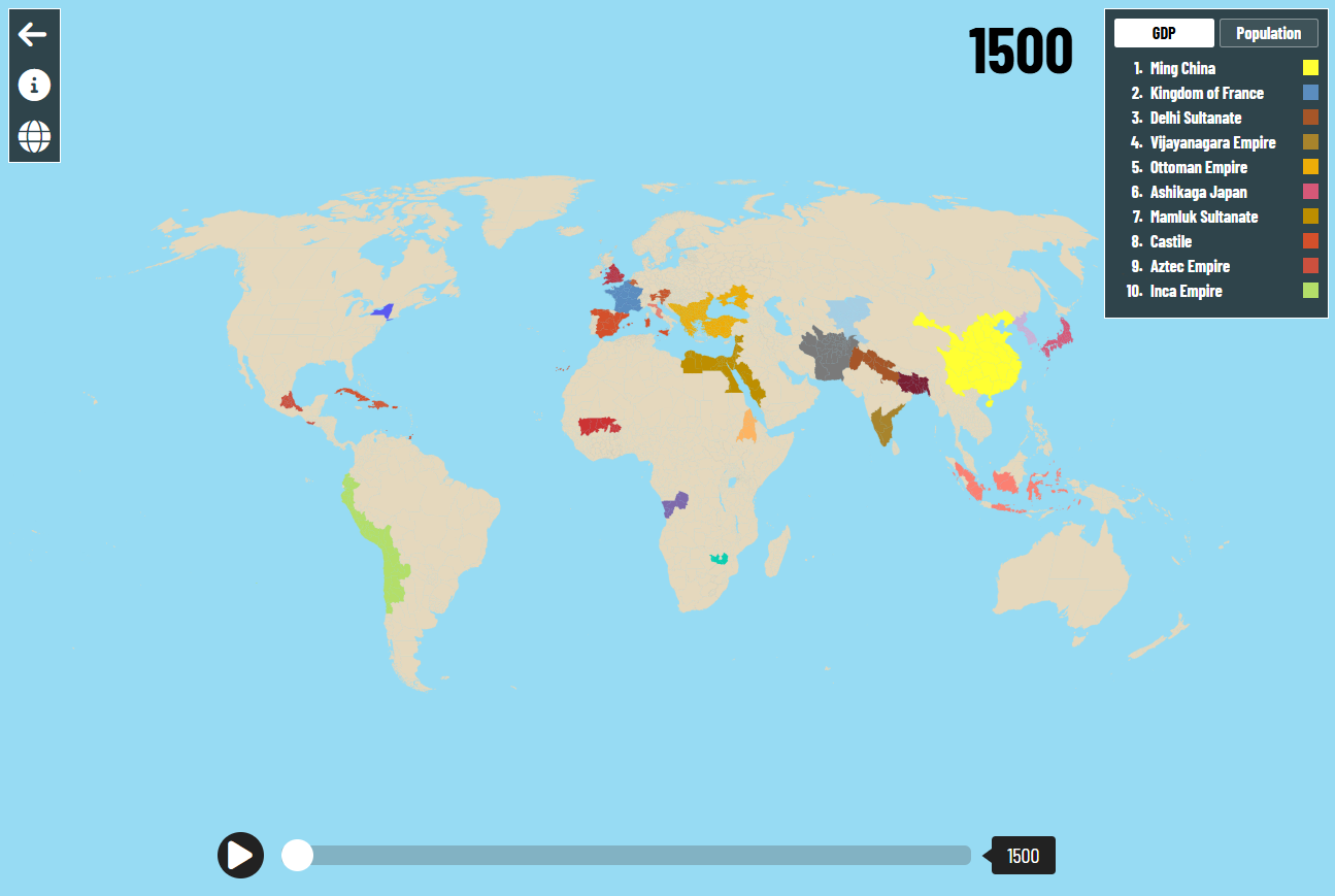
Five hundred years of human progress, on one map.
An interactive map of every major civilization from 1500 to today — GDP, population, and flags, drawn from peer-reviewed economic history. Built so students feel the rise and fall of empires, not just memorize them.
Data sourced from the Maddison Project · World Bank · Our World in Data
Be first to hear when new units launch.
We're rolling out new lesson plans, datasets, and classroom features every month. Drop your email to get early access.
Questions? We'd love to hear from you.
Teachers, schools, and curious students — send us a note and we'll get back to you.
History feels distant. Numbers make it real.
The students most likely to disengage from history class — the ones who light up in math, in stats, in econ — are the same ones who'd be riveted by the actual shape of the past. Historical Timelapse turns 500 years of human civilization into something you can scrub through with your finger.
Watch Britain's GDP per person multiply 1,200× between 1500 and today. Then ask students why — and why not everywhere.
Show students that India and China together produced nearly half of global output in 1700. The story of the West is younger than they think.
Quantitative students who 'don't like history' suddenly do, when history is a graph they can interrogate, not a date they have to recall.
Built for the lesson plan you actually teach.
Most "ed-tech" tools ask teachers to redesign their curriculum. We did the opposite. Historical Timelapse drops into the units you already cover — Industrial Revolution, Imperialism, Cold War, Globalization — with a single, beautiful artifact to anchor each one.
- Scrub through the Industrial Revolution
Watch British GDP per capita break away from the world average between 1750 and 1850. The 'Great Divergence' as a moving line, not a chapter heading.
- Compare empires side-by-side
Pin Mughal India next to Qing China next to Tudor England in 1600. Let students discover, on their own, who was actually wealthy.
- Connect to current events
Trace the rise of post-1980 China against US deindustrialization. AP Macro suddenly has 500 years of context.
- Free, forever, for classrooms
No accounts for students. No ads. No data harvesting. Funded so teachers don't have to pay.
Numbers your AP reader would accept.
Every figure on the map is sourced from the Maddison Project Database, the World Bank, and Our World in Data — the same long-run economic estimates cited in college-level economic history textbooks. Students can click any data point to see its source and methodology.
Ready for your next unit?
The full interactive map is free, ready to use, and works in any modern browser. No sign-up required.
Free for K-12 and university educators. No credit card.